P.S. I would love if Pandora's secret would pay this post a visit :P.
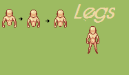
Okay I got bored and decided to step outside my comfort zone and do a large human. I have got the top half done, you can give me c&c on that if you like, but I cannot for the life of me put together some decent looking legs. I want it to look like he has his legs slightly bent but not tucked underneath him. Any tips you could give me would be great thanks.
P.S. I would love if Pandora's secret would pay this post a visit :P. | |
Personally, I would widen out the shoulders just a little. He's got a good sort of 'neck' curve going on near the head, but the body curves into the arms so much at the top that it seems like he has thin little shoulders that over curve.
I'd also straighten the legs a little more. He looks kind of like his legs are spread out right now, at least in my opinion. His arms had the same issue at first, but that has been fixed now. | |
Okay newest and I think last edit. Made the legs closer together, widened the shoulders and actually pretty much completely changed the legs if I'm honest.
| |
Much better, but I thought something seemed a little off so I made a very quick edit. All I did was alter the feet, and pelvic line slightly. I also saw that the arms were uneven, so I made his right arm the same length as the left because the lefts length looked better. Here is the edit.
 | |
He has a pose as if he was in a marching line or drum line....I'd space out the legs abit give him more of a heroic pose.....I don't really see anything else worth criticizing.Is his left arm supposto be darkened?
(These changes wouls only help if he is gonna be used in a game of sorts) | |
Yes it is, it's defining the light source, which is from the northwest(If you look close the left side has a bright highlight).
| |
Yeah that's what i was tryna go for, to have the legs at least a lil more spaced out so it don't look so so weird but meh. I think the reason Fisher had the left arm darkened is to show that the light source is coming from the left or west.
| |
Fair enough. Now that I examine mine closer, it does seem like my version might be more suitable for a female version.
| |
I visited! But to due a lack of tea and cookies I decided to leave just moments later.
| |
Don't the arms look a good hand's length too short to anyone else? At the shortest, the wrists should rest at crotch level, not stomach level.
Even if the arms are supposed to be in something resembling a martial arts ready stance (in which case the length is about right), the elbows should be dropped a little, and highlights added to the upwards-facing side of the forearms to show the outwards angle of the lower arms. | |

Made these ;).