ID:977937
Sep 15 2012, 6:22 am
|
|
Sep 15 2012, 6:58 am
|
|
It's painful to look at!
| |
Could, you at least tell me whats wrong about it? I don't see how that comment would help... Please just post C&C
| |
It's rather plain. Needs more detail.
The fire is very "patterned" it seems like you created a pattern then "cut out" the basic shape you wanted from that pattern. It needs more detail and diversity. The shape of the body could also be improved a bit as well. The feet seem to be "out" a little too far to the sides, and the arms are rounded, no elbows. on a scale of 1 to 10, 1 being painful to look at I give it a 4. A few minor changes and some time spent could easily bump it to a 6 or 7 | |
Dariuc wrote:
It's rather plain. Needs more detail. This is exactly what I needed thanks so much ^_^ And I didnt notice the elbow thing should work on that. As for the fire that actually what I did, I'll try to take away the pattern effect. Edit: Also what needs more detail? | |
Dariuc wrote:
The fire and water. For the water, I used light colors so the detail doesn't show but I'll try to fix it. | |
their minds are exploding at the same time!!
or maybe they are holding one big flaming balloon. I don't know whats going on | |
Yut Put wrote:
Just to clarify, are they all male?... You'd have to check the other side o: Please post C&C | |
Suicide Shifter wrote:
their minds are exploding at the same time!! Lmfaoo I can see that happening, I'll change the arm position. | |
I actually really like the potential of this. It's different, very indie. Keep this up but add variety, show more of what you can do with it.
I reckon you could do a nice game with these, I'd just say you should take the black outline off the players. | |
Red Hall Dev wrote:
I actually really like the potential of this. It's different, very indie. Keep this up but add variety, show more of what you can do with it. You're not that bright, huh? | |
Constructive criticism : definition thereof
Main Entry: constructive criticism It doesn't mean insult or demean. It means offer helpful advice so that he can improve it. Aside from that , I said just about everything you just said, three posts ago, and I was alot nicer about it. | |
Vrocaan wrote:
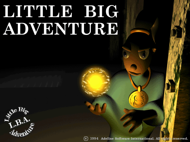
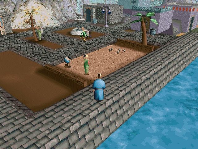
Red Hall Dev wrote: Actually it's more about foresight :) Let me explain. The reason I credit this is that it reminds me of a game called Twinsen's Odyssey, an independent French game that very popular back in the 90's. It was an interesting puzzle/adventure game about a guy on an alien planet in an alien universe. It keeps on getting weirder and the entire game is one big mind-feck. Needless to say it's pretty fun, and the distorted long faced, almost ghostly characters made it original and unique. Underneath this person's graphics I see very interesting opportunities arising and I encourage them to follow where this art takes them & I only hope the game is interesting as the style. So sorry it doesn't look like Gogeta or Majin-Steriods but there's a lot more to graphics I think than maybe you realize.   | |
Agreed on effortless. It would be nice to see four directions and some animation but I think if they put time into it it could be good. Here's a little example I put together:
I think clothing and hair make a big difference. Then imagine that in four directions. Could be quite nice. Oh and I know the color shading is weird, just 2 minute example.  | |
