ID:971945
 
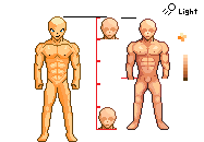
im trying to improve my iconning skills, so i thought of making this..

i know that the legs are not that good, they r not detailed, and u can see that there is a difference between the top part and the leg part, top= more detailed.

P.S: The color palette is not mine, its A2J2TWIARI'S so bro i hope u dont mind using urs, and if that bothers u i would change it :D
click this Gif link in order to see an animated pics of the steps i did to make this icon.
http://gickr.com/results3/ anim_aabcdfe3-27ee-b5c4-0957-6f43129ed3c8.gif


the purpose of this icon is to make me familiar with male anatomy.
tell me which leg icon is better 1 or 2?
1.
Image and video hosting by TinyPic


Image and video hosting by TinyPic


2.
Image and video hosting by TinyPic


Image and video hosting by TinyPic

Edits:

Image and video hosting by TinyPic
* Fixed the Chest issue.
His head is creepy. The smile and "nose" aren't really helping. His eyes look weird. He is also missing ears. The hands are too blocky. And it looks like he has a ":<" face on his chest lol.
ok thanks i ill try to fix that
The shading is not consistent. The chest appears to be shaded from above, the arms from the right, the left leg from the right, and the right leg from above and slightly in front.

The "shading" on the shoulders doesn't look good either.
so the only problem is shading?
No. Your anatomy is off, too. For example, the triceps end a bit higher than that. I don't like the really dark pixels on the inside of the elbows. Also while you are going for the muscular look, define the lower abdominal muscles a bit better. Mainly around the pelvis.
Normally i would edit your piece but I've tried it a few times and I find that I change too much so instead of remodeling your entire 'basė'i'd thought i'd give you some good tutorials and references to help you. Your biggest flaw is in the anatomy itself followed by your colours, imma link you to my favourite skin-palette.

Just take a look at these links; perhaps you'll learn something!

#23 is really good ://browse.deviantart.com/?order=9&q=skin+colours&offset=24#/ d4zq3js

Careful with this one; not entirely sure if it is a safe site...
http://cgeverything.co.uk/wp-content/uploads/2011/09/ Model_Page21.jpg

This one is a holy grail: .deviantart.com/?qh=§ion=&global=1&q=how+to+draw+torso#/ d3jai3f

tp://browse.deviantart.com/?order=9&q=male+torso&offset=48#/ d4e1dkg

http://browse.deviantart.com/?qh=§ion=&q=tutorial+male#/ d1qfmps
Sers000 wrote:

P.S: The color palette is not mine, its A2J2TWIARI'S so bro i hope u dont mind using urs, and if that bothers u i would change it :D

Lol! I wouldn't mind. Why would I? Also, that palette was rather boring and weird, so feel free to use it.

Also, I think you've improved a lot as this piece is a lot better than your previous ones. But as others said this needs to improved as there are many weird things in it.

P.S. - Even if you don't follow others' advice, do try to fix what Pandora said; he's pro!
ya im looking at the tuts he gave me and they r epic, THANKS Pandora
I think your maybe trying a little bit to hard, maybe start off with something more simple? That way you can practice the techniques used for shading and defining a light source without having to worry about the complicated contours of the human body.
.....did this edit to the leftside of the body using my phone and crappy pixle app.....the colors suck....but I stuck with em since the app sucks.

http://img571.imageshack.us/img571/2434/image1uyo.png
Basicly defining the male anatomy bit better.Maybe lengthen the arms and legs abit...and please change the pallet use 4-5 colors....
In response to MademanOne
MademanOne wrote:
.....did this edit to the leftside of the body using my phone and crappy pixle app.....the colors suck....but I stuck with em since the app sucks.

http://img571.imageshack.us/img571/2434/image1uyo.png
Basicly defining the male anatomy bit better.Maybe lengthen the arms and legs abit...and please change the pallet use 4-5 colors....


thanks bro now i know what my mistakes were...

Yut Put wrote:
wow... the pants were really, really poorly done..

..and this will never fit into a game

This is not for a game, its just an icon so i can practice shading and anatomy.
Photobucket

buff = not pretty

Ripped = sexy

would of did more but >< im busy like a boss.
In response to Southend_boi
Southend_boi wrote:
Photobucket

buff = not pretty

Ripped = sexy

would of did more but >< im busy like a boss.

i think its pellow shaded, except for the head, but thanks anyway the outline is good
The pecks and abs aren't attached to eachother....there's a coupple inches between them and because the flexible chest piece that holds the ribs together is there....so anatomicly incorrect to have them that close.
They are that close together but the top abdominal muscle isn't that shape it's a downward slanted shape towards the middle and the abs get bigger as you go down not smaller. Also there is 8 of them not 6 lol.
http://th09.deviantart.net/fs70/PRE/i/2011/180/6/2/ anatomy_practice____by_moni158-d3kfwa9.png

@Sers000 - i dont do pillow shading maybe you should look up pillow shading you'll see every pixel of my edit is far from pillow shaded.

@MademanOne - Pecks and Abs are that close it actually depends on style and preference so... anatomicly i am correct. i go about different styles when making skinny, ripped and buff characters. i find that part of the ribs look better on a buff shaped character and thats the only time i actually use it.

@GreatFisher - style and preference, also not everyone has 8packs o_O 6packs are better fit my style.
My mistake.....I haven't drawn people or anything in a while guess I'm getting rusty...
In response to MademanOne
MademanOne wrote:
My mistake.....I haven't drawn people or anything in a while guess I'm getting rusty...

No, you're right, the body is pillow shaded except some parts of the abdomen. The head uses a light source while the body does not.

Also, everyone is right about the pecks being too close together as well as the abdomen being shoved up into the pecks.

Honestly Sers, I think your base needs a lot more contrast in colors. You have the black outline and then like three colors of orange. A lot of the time you can use color to give a better representation of depth than you would with an outline.

Photobucket

I did a really quick remake of what I'm trying to point out.

1. Drawing a light source can sometimes help you convey the light hitting the body.

2. The body was extremely large so I cut it down to about 5 heads tall.

3. Everything on the body was large. Pecks were huge, Abdomen was huge, and legs were a lot further from the crotch than they should have been comparatively to torso and up.

A lot of your definition of the muscles and everything else was lost with all of those oranges. You don't need extreme contrast in colors to define parts of the body. Sometimes a lot of contrast is unappealing to the eye. I kept it relatively simple in terms of color.

I tried getting closest to what you were looking for, I hope this helps.

(You can see where I stopped giving a fuck about the edit in the arms and legs lol)
Page: 1 2