ID:965507
Sep 5 2012, 3:04 pm
|
|
Sep 5 2012, 4:23 pm
|
|
Not bad bruh. Keep at it.
| |
It has colors more than needed...
My only advice would be that you should try reducing the colors, keep it simple because atm for these small sprites you have tried to put a lot of detail, moreover you can't even see the different between many colors. Also, try changing the palette. Other than that, you've done good job! | |
Vrocaan wrote:
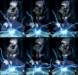
Meh. Agreement. People are giving this too much praise. Have any of you noticed the legs? Or that Sasuke's hair is bland? Or the iconsistant shadow under the icons? OR the bland lightning on Kakshi? Lightning cast light last time I checked, kk. | |
Its newby level graphic art, something you'd see on any anime game. There are no good light sources, the palette is poorly selected and for that reason the icons look flat. Sasukes face has 1 pixel between his eyes so he looks like a pinhead. I mean the icons are okay, but clearly this could use some more work and effort. The big thing people need to learn is that establishing your palette and having an eye for color is very important. Instead they use like 90 colors and none of them are selected thoughtfully.
| |
:D thanks for the some of the C&C well i will take this into consideration while im editing the work. And well in response to NNAAAAHH i got the ref for sasuke from a fully colored manga page so the colors were a little "bland" like you said.
here's the link: http://c.mfcdn.net/store/manga/8/60-567.0/compressed/ h001.jpg Then we move onto kakashi. I got his ref from the anime where he sealed up sasuke's cs mark and oro appeared yea that one. I for some odd reason decided to just paste them there on a white background to just see how it would look and to me it look pretty decent. BUT i am at falt for that part for not taking notice and atleast brighten him up a little :/  ^thats where i had it first just so you know. DvK87 your right i didnt thought fully select the palette. What i was aiming to do was to try and make it look as close to what i saw in the ref as possible to me i think i accomplished that but eehhh. thanks to both of you i was able to see where your coming from. | |
Pixel art requires a little more of you than replicating colors from a manga, in a manga the picture is more than 32x32 pixels large, in a smaller space you need to be a bit more creative with your colors and lighting to make the graphic look good, and not flat. For the Kakashi there isnt even a lightsource, despite the fact that the most defining characteristic of lightning is its emission of light. Here is an example:
http://imgur.com/W2n4G | |
The raikiri is all in the animation. A single frame won't be interesting, having the sudden variations in lighting is what really makes it look appealing.
| |
The best way to think of lighting is a random discharge of energy from a single point, this should help you make a realistic lighting icon.
| |
I find that RPGs that have day and night systems don't require the light source to be present on the pixel art, yet present in a filter. If you use a light source and place it on a base, that just shows your game will only have one, static, time.
An example would be this:  Though it's still a WIP, the character uses frontal lighting, this allows the pixel art to have "technique" while I would be able to implement a day and night system. Meaning the light source wouldn't just come from the west/east for the duration of the game. (Another note to take is to add more contrast in colors, example being that the orange looks very dull because there is very little to no change in color. Same goes with the hair.) | |
The Monster Atlas wrote:
I find that RPGs that have day and night systems don't require the light source to be present on the pixel art, yet present in a filter. If you use a light source and place it on a base, that just shows your game will only have one, static, time.smh this been a WIP for like 5yrs and you still haven't made any improvements... | |
smh this been a WIP for like 5yrs and you still haven't made any improvements...Correction! its been about a month :3 | |
VixiV wrote:
smh this been a WIP for like 5yrs and you still haven't made any improvements...Correction! its been about a month :3 I was busy moving my stuff into my office at Valve, sorry. | |
:o ^ epic but yeah sorry i havnt shown any progress with it because i've been busy with other things but ill be sure to update it when ever used i get around to it
| |

