ID:815467
Jun 14 2012, 10:17 am
|
|
Jun 14 2012, 10:40 am
|
|
How do you get that glossy look?
| |
By using an array of colors correctly and placing them correctly. It's color choice, vibrant colors, not dull colors.
| |
The hair looks artificial. It doesn't look like hair but like thick plastic wig on top of her head. Also, her right tit could use some tweaking around the nipple.
| |
I agree with EmpirezTeam
Her right boob looks bigger than her left and her bangs look like plastic tubes unless that was what you meant by "pillow bangs" | |
Boxcar seems to of improved the hair a bit, but the bangs look like leaves in his. The bangs seem to be the most noticable issue, but I think the lighting on the face, particularly near the left eye is a bit odd. Also the right eye looks smaller than the left if you really look at it. Too small in my opinion, but that could be an angle issue.
| |
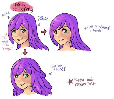
GTD has the right idea, restyle the hair to be consistent as he/she outlined.
The eye is off a little. The bottom of the eye should roughly be at the tip of the ear in height, if the head is angled straight up vertically. | |
I agree with GTD, but it's also worth noting that I love the thin/sharp strands version. Both consistent versions would work, and round may suit the style you're aiming for more; not sure. Thin/sharp, however, looks frickin awesome and very anime-like yet realistic.
| |
Looks better, only, the eyebrow isn't natural. It looks more like a brush than hair, lower it a bit and give it some body.
I like the hair. =] | |
Awesome! The hair looks a lot better! Oh and you changed the hair color.. are you keeping it this color or are you planning to change it back to purple?
| |
Eyebrow is definitely better, but it's a little too dark, and sharp. Try to anti alias it so it appears to somewhat fade into the face (just a little, you don't want it to look like a smear)
Maybe make it a little thinner, too, but that's just what I think looks good for a female, it's possible for an eyebrow to be that thick. Good work! | |
Thanks, and yeah I'm keeping the hair this color, but I'm going to change the eye color though l0l.
| |


