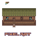
nice little farm house ran down farm house :)

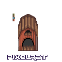
Scary Barn

Just a HUD i made awhile back
cool little man i made

i posted this a while back
ID:719922
May 2 2012, 2:49 pm
|
|
lol kinda does look like a pig im up to work on a project if anyone is looking for a artist
| |
The proportions on your barn is very strange. It looks kind of small, to be honest. I think this is a result of your palette choice (which I disagree with) and your shading style (which is making your work look flat).
There is no illusion of depth for the interior of the barn, even though it is obvious that is what you were going for with the shading. Frankly, the overall shading style for your barn doesn't make much sense. Your HUD thing is bland and lacks texture. It also does not have enough contrast for the icons on the cloth or scroll or whatever it's supposed to be. The style of shading on your sword makes it look very thick, almost like it has a square cross-section, but not sharp: ill-suited for cutting or stabbing. There needs to be more emphasis on the highlights along the edge of the blade to give the illusion of sharpness and less emphasis on the highlights/shadows contrast that rides down the center of the blade. I would have liked to see a more distinct pommel on the hilt, but that sort of detail is unimportant. | |
Apart from that it looks really cool, especially that metal work on the sword. Looks perfect.