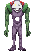
Finished, still frame:
ID:258909
Aug 27 2010, 12:48 pm
|
|
Yeah, I already know the feet look weird, bite me.
Finished, still frame: | |
Aug 27 2010, 2:01 pm
|
|
Jordan11
|
The mask needs more contrast. It looks really flat.
|
Black Label Studios wrote:
Yeah, I already know the feet look weird, bite me! I think it looks fabolous! the feet are actually quite good(just no highlighted parts on it, only shadow which makes it look different than the rest of the body.. so i would've suggested to make it lighter) You collor use is very vibrant ( especially the green pallet!!! ) Good job! | |
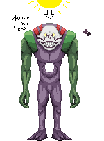 Update, sort of. Move this to the WIP section please, didn't think I'd be furthering this but I did. Sorry about the mix up. | |
Boring lighting is boring. There are highlights on the shins and inner ankles but none on the top of the feet?
You also need to clean up the jagged lines. You've done well with avoiding them, but go over it and clean up what you missed. Just in case you don't know what I mean:  Also, I think this could benefit greatly from AA. Some other things: Use your lighting to define shape not lines. Don't use a white background, it isn't so great on your perception of color.  My edit next to yours. I worked on some things, primarily the right half, until I got bored. It looks like you got tired of it after the head and shoulders and ran through the rest. Put as much attention into the rest as you have there. I urge you to consider a more interesting light source as well. Top down is okay, better than downright pillow shading (which is present here still), but you could have a lot more to look at if you couldn't draw half of this, flip it, and have the other half. | |