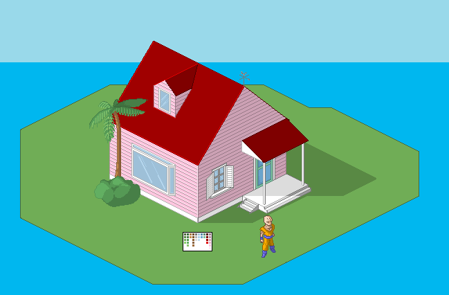
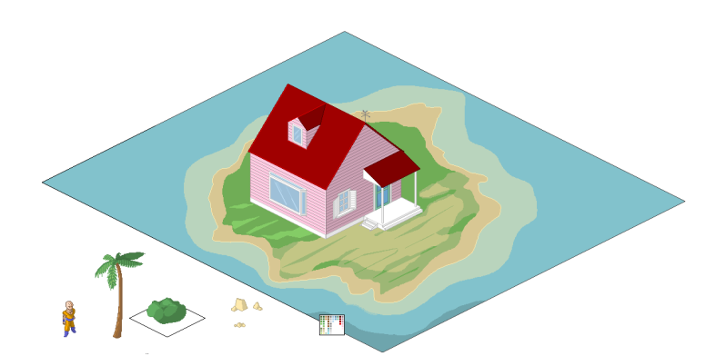
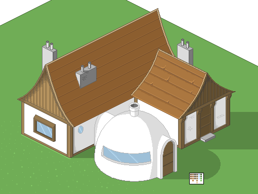
haha, yes yes... ANOTHER pixelation of Dragonball Z... but this time it's isometric ;)
Questions: Keep a black outline? or match it up with the colors? (those aren't the "final" colors btw...) I'm stuck trying to figure out how to shade the round building though. Also, keep the colors simple? or do some dithering, texture.
note: the little guy is shown for perspective only. (even then he's a little small)
~Cryptic
ID:258795
May 31 2010, 1:29 pm
|
|
May 31 2010, 2:32 pm
|
|
Looks awesome. But do lose the black outline.
|
Now that's cool! i like the perspective a lot.
When it comes to outlining in isometric pixel art you really base it around light and perspective, since it is different to 3/4 perspective you are showing how light effects different edges of the shapes and objects. Check this iso art video, really handy when it comes to stages to look at what other artists do in diffrent styles, this dude even wrote a book on iso art. http://www.youtube.com/watch?v=D3j4oQTstwk Also be sure to google some work: http://img.photobucket.com/albums/v56/SnakemanEXE/Iso9.gif http://i245.photobucket.com/albums/gg62/witchyhoy3/2479.gif |
If you really want some inspiration then check this one out
http://www.pixeljoint.com/pixelart/29178.htm |
In response to MdNight
|
|
oh my god that is incredible! it would be a long time before my work was at that level. nor do I think a dbz game would need such detail... haha. but still thank you so much for that little resource to study!
~ Cryptic |
In response to Cryptic
|
|
Cryptic wrote:
So... internet went down, thus the lack of update on progress. So until I get the "better" images transfered to photobucket... heres some eye candy of the pink variety. Thats kewl =0 maybe u should work on the land XD??? but for me looks kewl atm, still working on ;D, also the window we can see(the big one in the side of the house, needs shade =) |
In response to Etsukurenay
|
|
Give the roof more detail. Also some shade for the window(top one), seeing as how you've made the entire house's shade on the ground.
Also the tree/bush don't have any isometric feel to them. |
In response to Trickeli
|
|
Move the tip of the roof to the right more. It looks weird.
|
In response to Black Label Studios
|
|
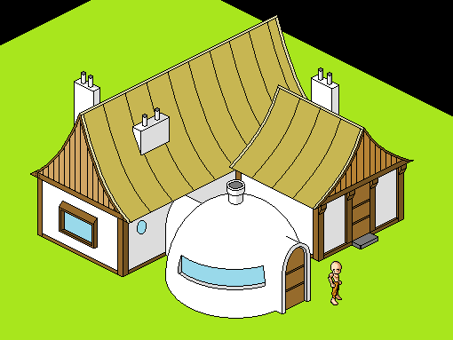
I appreciate all your input. on the island...that was a place setter while I worked on something better... to be uploaded when I get a better connection. I can see also what is meant by the trees and bush looking a little flat in perspective. organic iso is a bit more difficult than geometric. I've updated the colors for gokus house, and again these will be uploaded on a better connection. that said, again thank you. also. the roof of the kame house has no visible texture that I've seen, so it'll stay red.
|
In response to Cryptic
|
|
In response to Cryptic
|
|
In response to Etsukurenay
|
|
2nd picture, only the small square house looks worn out.
Also two horns on the long one seem weird. |