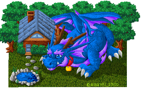
I'm started to get the hang of pixelating but as a new pixel artist i was wondering if theres still certain things i need to work on?

ID:258720
Mar 4 2010, 7:18 pm
|
|
I would suggest taking this to the forums of pixelation ( way of the pixel ) and pixeljoint !
The pixel artists there will/might help you to reach greater hights. | |
Looks pretty cool, although there are a few things that you could do to improve on this.
Colour wise your dragon and some of the turfs lack contrast, i would fix that especially on the blueish colours, maybe add a little hue shift in with the colour ramp. The the pinkish purple colour used on the wings and belly etc is pretty noisy... toning down would work with it, not to mention there are some are a lot of random colours in there you don't need. The nails could be brighter, when working with grey for effect take a colour direction depending on light, see how i implemented a slight blue? This image should clear up a few things, i also cleaned it up and did a bit of reshaping to help, i won't finish it because where is the fun in that for you ;)  Although i am a little unsure what the top left area of the dragon is meant to be lol a wing mixed with the tail or something? Anyway's it does look good, i hope i helped. keep up the good work! | |
Chris-g1 wrote:
Looks pretty cool, although there are a few things that you could do to improve on this. ahh i see i had a hard time coloring the dragon ..dont know why i chose blue... and so should i use less colors? to be less noisy? err and less random? oh wait i get it now the image helped thanks a lot ^^ | |
Pandora'sSecret wrote:
I would suggest taking this to the forums of pixelation ( way of the pixel ) and pixeljoint ! I was thinking about going to Pixeljoint....not sure whats stopping me | |
Nah it was just HOW you chose the colours lol the noise was coming from how pure the shade was, also you dont have to dither ;)
| |
Chris-g1 wrote:
Nah it was just HOW you chose the colours lol the noise was coming from how pure the shade was, also you dont have to dither ;) ooooh i see i see :D hmm how would you choose colors? | |
http://www.natomic.com/hosted/marks/mpat/colours.html Give that a read, it should help. Be sure to check the tutorials section, aswell as previous WIP posts, you may learn things without having to ask about them.
| |
Pmitch wrote:
http://www.natomic.com/hosted/marks/mpat/colours.html Give that a read, it should help. Be sure to check the tutorials section, aswell as previous WIP posts, you may learn things without having to ask about them.oh wow O AO thanks for the link! | |
Maybe the wings of the dragon looks a little weird. but overall, its good ;)