ID:258577
 
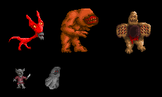
I have been working on some new graphics for a game. I am better than I use to be, but I do not think I am going to get better without some direction on what I am doing right and what I am doing wrong. This is what I have so far.


The first creature is the smiler. It is a large, fast creature, but he is a little frail. He has a skinny neck and no arms. However, to make up for his weaknesses, he scares his enemies by using his flat head to make himself appear larger and more powerful than he really is when facing them.

The second creature is the bone eater. He lives in dark areas, so he has no eyes. He loves to eat bones.

The third creature is the flesh maiden. He is a fat creature that opens his stomach and traps anything inside as he slowly stabs them with his spikes.

The fourth creature is the dark imp. It is a very evil and dark imp.

The final creature is the dark follower. They pretty much wear a cloak and walk around with red eyes.


Any criticism is welcome.
They all need to be redone. Not that they are poorly drawn. They are just to childish. They need to look more evil. Just take a look at some final fantasy 4,5, and 6 pixelated enemies. They just need a little more kick my friend.
In response to Cold_Solstice
Cold_Solstice wrote:
They all need to be redone. Not that they are poorly drawn. They are just to childish. They need to look more evil. Just take a look at some final fantasy 4,5, and 6 pixelated enemies. They just need a little more kick my friend.

And who says that's not the style he's going for?
The first one's face seems a little awkward to me, dno what to say. The second doesn't have enough muscle definition in my opinion, maybe a little more indentation where his muscles are, he seems kind of doughy. Since he has no eyes, his mouth could probably cover more of his head, bigger teeth, and not stick out so much, they look a little like kissy lips. Third one is also doughy, he looks like clay, though it might have been on purpose. His clamp stomach thing looks a little awkward if you were to think of it realistically, maybe you could make it kind of zigzag opening, like sharp teeth that open the same way as it does now:
<=| |````//```|=>|
``| |=>``//```|<=|
<=| |````//```|=>|
``| |=>``//```|<=|
(sort of like that, just close together and functional, and one row of spikes on each piece)(ignore the `)
Fourth one is pretty good, just the way his legs/body are, he seems a little twisted up, his legs kind of face left, while his body is facing right, I figured you were trying to make it sort of like that, but its a little too twisted. Fifth one's eyes are little boring a little too simple, his cloak seems kind of puffy, I think it needs a bit sharper edges on the folds (where it goes behind him) to look like its actually folding behind, rather then a cloudy puff around him. And if its animated it'll look even better. Well that's my opinion, hope you found some of this useful.
PS: Cold_Solstice, instead of just telling him to make it better, help him how to make it better, unless you've never done anything, ever, you should know that you need to know how to make it better before you can do it.