In response to Akto
From now on, do not post work that "references" other pixel art unless you state that you used it as a reference in your FIRST post. This all could have been avoided.
In response to Chris-g1
Chris-g1 wrote:
Akto wrote:
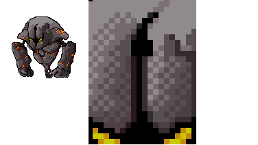
Here is the update:

Added magma to it.
Added different color palette.
Added extra color to the palette.
Added more AA (( I think I did..... >.< ))


Just an idea, try dithering...

Photobucket

like so...

@ Akto
I saw this a few days ago I thought it was a pretty cool piece, though you need to work on those jagged/double outlines(the black ones of course), even the reference doesn't use those.

@ Chris-g1
There's tons of ways to improve this shade(see http://www.pixeljoint.com) without using the dithering technique which is highly overrated. Rather than suggest someone to "dither" [and possibly changing the whole style going on here] , suggest them to texture (think of a rock and what fits best for a rock and base your crit off that) in the way you think best suited for what material he's making.

[Thats not even dithering the right way, that would be dithering like a maniac. First of off you're not letting the solid colors build, you're not giving them enough room. The purpose of dithering is to smoothen transitioning, how can you smoothen what you didn't let transition in the first place!? It's a complete and total criss cross dither, it looks like a checkersboard. And the above the right eye you just demonstrated double outlining by not letting the lightest shade just touch the black (You put that purple outline around the whole eyebrow which is basically a pillow shade).]


In response to Akto
When you reference other people's artwork, please cite said reference.
In response to Hulio-G
@ Chris-g1
There's tons of ways to improve this shade(see http://www.pixeljoint.com) without using the dithering technique which is highly overrated. Rather than suggest someone to "dither" [and possibly changing the whole style going on here] , suggest them to texture (think of a rock and what fits best for a rock and base your crit off that) in the way you think best suited for what material he's making.

[Thats not even dithering the right way, that would be dithering like a maniac. First of off you're not letting the solid colors build, you're not giving them enough room. The purpose of dithering is to smoothen transitioning, how can you smoothen what you didn't let transition in the first place!? It's a complete and total criss cross dither, it looks like a checkersboard. And the above the right eye you just demonstrated double outlining by not letting the lightest shade just touch the black (You put that purple outline around the whole eyebrow which is basically a pillow shade).]

thanks for the pointers ;)
In response to Chris-g1
Chris-g1 wrote:
[Thats not even dithering the right way, that would be dithering like a maniac. First of off you're not letting the solid colors build, you're not giving them enough room. The purpose of dithering is to smoothen transitioning, how can you smoothen what you didn't let transition in the first place!? It's a complete and total criss cross dither, it looks like a checkersboard. And the above the right eye you just demonstrated double outlining by not letting the lightest shade just touch the black (You put that purple outline around the whole eyebrow which is basically a pillow shade).]

thanks for the pointers ;)

Np, I read it over and it seemed kind of hostile, sorry if it appeared that way. I was just trying to add enthusiasm to the post so that it wouldn't be too boring to read, sometimes I feel like I'm just going "blah, blah, etc".
Page: 1 2