thanxxxxxx
Chaos
ID:257937
Dec 12 2007, 12:42 am
|
|
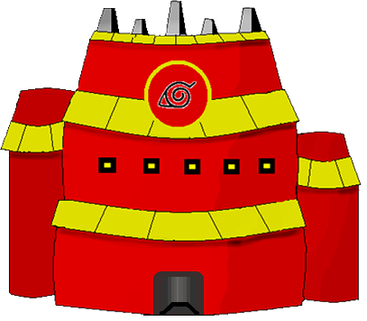
kk well chaos here , i ve made this kage house frm anime called naruto and i reli want to improve it so i can put ti in my game plzzzz help. also rank it out of ten ,ten being the best
thanxxxxxx Chaos | |
Dec 15 2007, 1:39 am
|
|
ChaoticHatake
|
hellooo plzz help me ?
|
If you just...look at it you can see whats wrong!
It's too flat and its too direct of a look, your above the players your never going to see the building like that! Plus the shading reflects laziness..and he took no time to make the symbol look good, he didn't even make that. The symbol is copy and pasted on, it has a white outline! | |
Robbie Hewitt wrote:
If you just...look at it you can see whats wrong! Excuse me i did make tht symbol but i made it on photoshop and i did copy it but i still made it xD | |
Robbie Hewitt wrote:
Thats not the point...the point was you should have removed the white outline on it! well yh i admit my work i no im not very good pixel artistst sorry for that but there was no real need for C &C anymore btw im looking for Some dbz iconners and pixel artist (im too lazy so ima code) Off topic page me on my key or here is my msn [email protected] | |
Hmmm,
FYI "Iconner" and Pixel Artist are the same thing! However, Pixel Artist is the proper term seeing that "iconner" is not a actual word! | |
Oh i was picked for tht but i denied because it waas too early for me since i jus strted pixel art and i think i am shit in pixel art xDD
| |
Btw rob can i hav ur msn its a betta way to talk xD add me mine is [email protected]
| |
Well it looks okay, but you have some problems with Lighting and Shading, and use one of my favorite pixelart technique, dithering. Unless you are going for that cell-shaded look.
Shading links: http://derekyu.com/extras/pixel07.html http://new2max.deviantart.com/art/ Pixel-art-tutorial-Shading-59410241 It also does look flat like Robbie said, you may want to make a new contrast for it. And it looks like you hand drew the whole thing in MS paint/ photoshop, which isnt really pixel art. What you could do, is take some line art Tutorials to draw the building first, ask if its okay, then try coloring it in and adding a light source afterwards. Line art Links: http://www.natomic.com/hosted/marks/mpat/lineart.html http://derekyu.com/extras/pixel05.html And then repost the whole thing once all done in shading and coloring. | |
This isn't pixel art, so stuff like dithering doesn't really matter (unless you want it to be pixel art, when well you'll probably have to redo it to a degree)
You have a lot of cleaning up to do. More detailed shading, with higher contrasts. Remove those, uh what looks like more shadows, dark streaks under the various yellow (roofs?), Clean up that symbol as well (remove the white stuff from around it). When using photoshop ALWAYS work on a transparent background. | |
I didnt use photo shop -_- i dont even hav it but i understand the rest and baka is helping me out so thnx anyway maggeh
| |
ChaoticHatake wrote:
I didnt use photo shop -_- i dont even hav it but i understand the rest and baka is helping me out so thnx anyway maggeh You didn't use photoshop eh? Well...whats this about?: ChaoticHatake wrote: Robbie Hewitt wrote: | |
Robbie Hewitt wrote:
If you just...look at it you can see whats wrong! I have no problem with the Kage Building looking like that. | |
You stole the door of my Kage Building >:/ but thats ok you told me about it
Post [link] | |