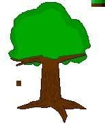
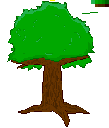
I am working on a tree for a friend, might become a permanent job, though I doubt I can find a way to take it.
Well, crtique away!
They are the same, just different .extensions, sorry.
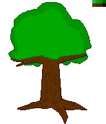
[edit] Oh yeah, I didn't fill any detail on the leaves, I am definitely not leaving it like that, haha sorry.
[edit2]
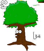
Okay, here's an updated one, and a funny just because I was bored...my friend say's it looks wierd (not the funny one, well that does too haha) but I am guessing it is the right branch?
ID:257855
Aug 5 2007, 8:53 am (Edited on Aug 6 2007, 4:34 pm)
|
|
In response to Latoma
|
|
Looks good! Neat perspective. Keep goin'!
(Here's some other examples of tree pixel art you can get inspiration from or ignore completely :) ) http://www.pixeljoint.com/pixels/ new_icons.asp?search=tree&dimo=%3E%3D&dim=10&colorso=%3E%3D& colors=2&tran=&anim=&iso=&av=&owner=&d=&dosearch=1&ob=search &action=search I'm a fan of this one: http://www.pixeljoint.com/pixelart/10466.htm |
In response to TheMonkeyDidIt
|
|
TheMonkeyDidIt wrote:
Looks good! Neat perspective. Keep goin'! XD I viewed the page, and the moment I saw that exact tree I was like "That had to be the one he referred to", then I compared links. God I'm too sharp. |
In response to Latoma
|
|
Latoma wrote:
XD I viewed the page, and the moment I saw that exact tree I was like "That had to be the one he referred to", then I compared links. God I'm too sharp. Yeah, it stands out. Really clean and detailed for what, like 6 colors. That being said, I like this one, too: http://www.pixeljoint.com/pixelart/20180.htm |
In response to TheMonkeyDidIt
|
|
Well, I updated, just "bumping" to get this criticism going.
|
Mkay, I am not a pixel art pro, but I'd suggest small patches of Darker Green tones in the center, to give the illusion there's folliage hidden within the tree, instead of purely on the surface. Maybe splotch in a few dots of dark brown to make a branch show up within covered in branches with Dark Green near it (the 'other' side of the tree)