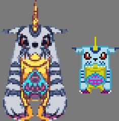
Mine:

ID:2345406
Feb 13 2018, 11:33 am (Edited on Feb 13 2018, 2:13 pm)
|
|
Reference:
 Mine:  | |
Feb 13 2018, 3:29 pm
|
|
Hey, I really like the sprite, I haven't seen digimon stuff in ages, it got me inspired to do one using a different ref pic. I used less saturated colours which I always think looks more serious.
 | |
My looks more cartoony- yours looks more serious. I don't know which one, if any, is better. It may just be a different style rather than one is better.
| |
Are you an experienced pixel artist sir? Your art shows that. I only practiced improving my pixel art for 3 months. I've progressed a lot as my art used to look ugly. I also still need to learn a lot more about the techniques including shading.
| |
Replying to this thread a bit late but you have the right idea, but' I wouldn't limit yourself to such a small canvas to work with when you're doing practice pixel art such as this. This specific reference has a lot of detail that's needed to go into it and the size you're working with really can't handle that. Also don't be afraid to get creative and less "boxy" try to use more cluster shading and less single pixels. Gigarax had a good edit and pretty much nailed it on the head with its size limitations.
 | |