ID:1923146
 
...to the pixel art purists.

I've done mostly pixel art over the years, and most of my game related stuff has just been done in the DM icon editor. However, I have to say I'm really liking Inkscape. The ability to easily scale your art is a real time saver if you decide to change something.


Plus, drawing big and saving small tends to hide my mistakes ;) How many of you use Inkscape, or other vector drawing programs to do your art?
This seems pretty neat. I like how the quality stays the same. Might use this for a few things.
Yeah, the grass tile was the first thing I did. It's not bad, but you're right. It doesn't really fit with the rest.
Whatever. Vector graphics are sick :D

I generally use illustrator for vector graphics
I like my graphics like I like my women. With sharp corners and desaturated palettes.

...Actually, I'm not sure this cliche works here...
Welcome to the dark side, Flick! ;)

I've never fully understood the allure of placing pixels. I've found the scaling and rotation of vector art too useful and the whole process (at least initially) much faster. =)
Closer, but still not quite right...


Honestly, I think the lava is what looks wrong at the moment. The 'chunks' are too big, makes it look like its closer or something.
I think the lava's just too high contrast compared to the rest of the sprites. Purple up them rocks a bit.
In response to Ter13
Ter13 wrote:
I like my graphics like I like my women. With sharp corners and desaturated palettes.

...Actually, I'm not sure this cliche works here...

In response to Flick
Flick wrote:
Ter13 wrote:
I like my graphics like I like my women. With sharp corners and desaturated palettes.

...Actually, I'm not sure this cliche works here...


If there's a will..
This along with this, https://www.youtube.com/watch?v=hle2-bGDh10 has made my day. ROFL.
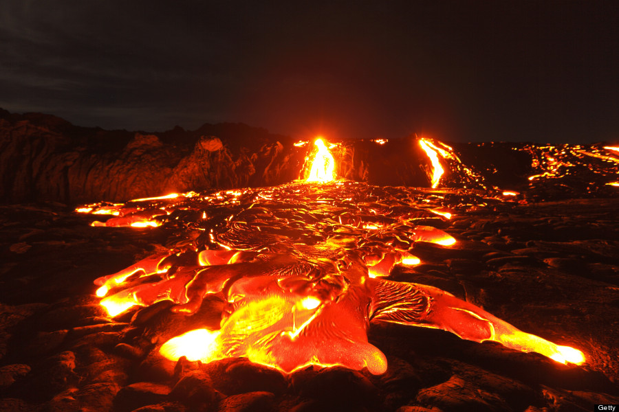
Looking at other textures of lava, your seems to match up pretty well. You could always take creative liberty and make it less chunky and more lava-...y?

Throw in some more whites as the hot contrast and break up the cooler spots a bit more, like in the image below.