Ready up window. (Edit: Size was shrunk sorry bout' that) it's slightly bigger)

Late Post... Damn im so curious about this game
DarkTemplarX96 wrote:
Ready up window. (Edit: Size was shrunk sorry bout' that) it's slightly bigger) Late Post... Damn im so curious about this game | |
Vegeta ssjj2 wrote:
DarkTemplarX96 wrote: Well if you like traditional Nazi zombies you'll like this game. Late Post... Damn im so curious about this game | |
Yut Put wrote:
The game's board looks awesome compared to the mockup I saw the other day! Does the web client allow smartphone connectivity yet? I can see myself playing this on the go. | |
Awesome :D
| |
Yut Put wrote:
daaaamn I saw it on twitch the other day without much art. you pump art out so fast | |
Kumonii wrote:
lol im currently developing same as that o.o lol guess there will be competetion xD Bah Kumo don't be silly. | |
DarkTemplarX96 wrote:
Kumonii wrote: Just pointing out that's not Kumo. I'm Kumo. >C | |
Kumorii wrote:
DarkTemplarX96 wrote: :O I'm confused. why is he allowed to live with that name? | |
I know I fucked up on the right text and that has been fixed, but I'm to lazy atm to take another screenshot so here.
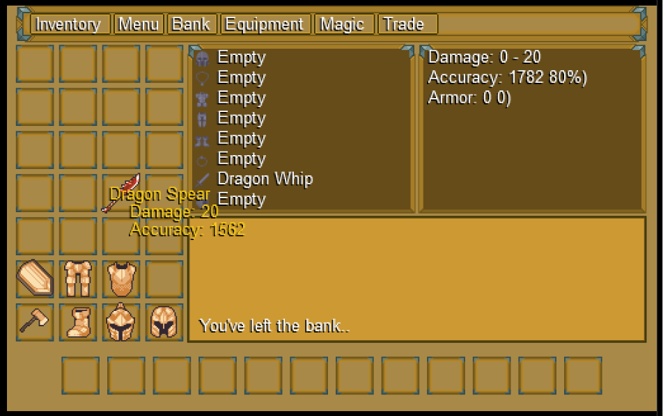 | |
Kozuma3 wrote:
I know I fucked up on the right text and that has been fixed, but I'm to lazy atm to take another screenshot so here. You have left the bank.. | |
Hi i need your opinions, with perspective for battle is "more interesting". I think 1st look better, but 2nd is easier to drawe sprite.
  | |
Marekssj3 wrote:
Hi i need your opinions, with perspective for battle is "more interesting". I think 1st look better, but 2nd is easier to drawe sprite. I think the only reason I'd say the first is just how incredible that map feels. Aside from that I wouldn't really go with it because I don't think I'd be okay with just seeing the backside of my characters. The second image fixes that obviously but yea it's a bit tricky to decide. I'll just say the second one because it feels like the right choice. | |
The game looks so different from when I played 2-3 days ago!
| |
 BYOND needs more action RTS games. Let'sgo. | |


http://www.byond.com/forum/?post=2051273