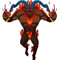
This is what I've done so far in terms on the
Ifrit summon
Need help with the horns for the current project I'm running
http://www.byond.com/games/Travylleb/ KeybladeWarriors?tab=index

ID:1470963
Jan 14 2014, 11:18 am (Edited on Jan 14 2014, 5:03 pm)
|
|
 This is what I've done so far in terms on the Ifrit summon Need help with the horns for the current project I'm running http://www.byond.com/games/Travylleb/ KeybladeWarriors?tab=index  | |
For the horns, try to use your shading to emphasize the roundness of it and give it the bumpy texture.
| |
No i agree the feet do look, kinda off I just can't put my foot on it tho .-. .Also the fingers and stuff look kinda squished together and makes it look wonky overall. Another thing i'm noticing about your art is that it looks really straight or you're not making it look round enough where it needs to be.
| |
Great lineart. If i may nitpick (not that it needs my nitpicking)some things I'd change would be:
-Orange hair is extremely saturated; tone it down. -His horns seem like an afterthought, as if pasted on. try to show where they sprout from. -Horns look rather flat, could use more volume. | |
You have come a long way, be proud. I had some time to do other things so I wanted to help out where I could. Plus, I need practice. :D
 -I made the hair/fire pop more -For the horns and body I hue-shifted the colors to make it stand out more (Horns shift to a purple and body goes to a more red/brown)Also, there is a weird red in there... still not sure if I love it.. but I think it looks alright. ;3 -I flipped the claws because they looked a little awkward and added more action to the character (completely up to you) -From what I remember of Ifrit he looked mean... so I dropped his eyebrows EDIT: If you do decide to change the feet to look more natural I would suggest going on google and looking up pictures of hooves for reference. They can be tough. | |
I like that the hands are downward facing, it gives a menacing, imposing feeling rather than an action feeling. The hands just need some work, is all.
| |
Well yes, I am not saying do what I do. I was just showing another option, sorry if it came off as forceful. I just went with more of a humanoid sorcerer for my own practice.
| |
The thing about the hands is it isn't the hands but the arms. The forearm/elbow area should be given more depth by placing the hands closer to the body (over the area I mentioned).
| |
Sadly i can't give any constructive criticism because I call everything "Amazing" =P