ID:122812
 
Keywords: 3d, art, dmi, maya, mel, memory, prism, render, script

Photobucket

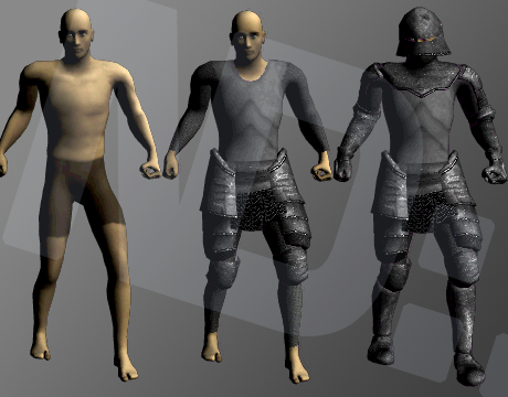
This is an example of the "body shot" that our Maya script outputs for each piece of gear and each character model in Prism.


This is just a quick status update because it's been a while since the last one. I spent a considerable amount of time the last couple weeks researching and developing Maya scripts.

Previously, we were using a program called SpriteWorks to render our 3d models down into sprite sheets. While I still think this program is very useful for people who have basic needs, it no longer sufficed for the demands of Prism.

The reason is that SpriteWorks only supports a few file formats. The file format that we found most reasonable to work with was Collada, or the DAE file format. DAE required us to save each piece of gear and animation as a separate file. This became unwieldy, but not because we couldn't keep it organized. Small differences in the files crept in, such as numbers of frames. There was simply too much upkeep.

Our task, then, was to find another solution besides SpriteWorks. There aren't many options out there! Instead, I spent a great deal of time learning the ins-and-outs of Maya and MEL (Maya's built-in scripting language).

I now have a simple batch command that renders down any given model with a specific, isometric perspective camera. It automatically loads and unloads each animation clip one at a time and rotates the model at 45 degree increments.

I created another script that uses ImageMagick to create a sprite sheet using the "montage" command line tool. I then load the entire sprite sheet into Photoshop and posterize / make certain adjustments. Finally, I have created a BYOND script that loads the sprite sheet, chops it up, and exports an appropriately named DMI.

The entire process is pretty much automated. Because of how gear is rendered in Prism, some manual adjustments need to be made, but this takes roughly 2-3 minutes for each sprite sheet. The challenge, now, is to find a frame rate and color level that I am happy with, without taking up too much memory.

I'm finding that DMI files, once loaded into memory in DreamSeeker, take up approximately 30-50 times more space in memory than on disk. This is a serious bottle-neck to Prism as it requires a dramatic reduction to the quality, resolution, and frame-rate of the sprites.

Please "vote up" the below feature request if you've been following Prism and want to see the game art with as much quality as possible!

http://www.byond.com/members/ BYONDHelp?command=view_tracker_issue&tracker_issue=3674


I still can't believe my eyes every time I see you post an update. It just seems so unrealistic that byond is compatible with these type of graphics. But keep up the work can't wait to see it!
ImmeasurableHate wrote:
I still can't believe my eyes every time I see you post an update. It just seems so unrealistic that byond is compatible with these type of graphics. But keep up the work can't wait to see it!

Thanks! Yeah, we're not really doing anything that BYOND doesn't provide built-in support for. The DMIs are just standard 8-direction files with 12 icon states/animations. Pretty simple stuff. There is also a "body shot", shown in the original post, and a "portrait shot". Your characters body shot will be shown in your character information panel or while viewing another player.

The main thing is that I don't think we're doing our artwork justice. We're cutting out a lot of frames of animation to reduce memory size. I'd like to see animations loaded on an as-needed basis. I think that is the very least amount of optimizing that could be done on BYOND's end.
I feel like the color map across his torso doesn't have enough contrast. The plates don't quite look like they're separate sheets since the shadows in the color map are so weak.

Other than that, looking good! :)
I can say that no one should give bad or negative comments to this. This is the first byond has ever had anything like this.
ImmeasurableHate wrote:
I can say that no one should give bad or negative comments to this. This is the first byond has ever had anything like this.

Actually, BYOND has had rendered graphics and pseudo-3d environments in a few games for a long time. OneFishDown was one of the first developers to start trying this sort of thing out. I've done a few projects with this style of graphics and perspective. Zaltron's done this as well.

My comment wasn't intended to be negative; It was intended to be constructive. I have a lot of respect for the development team behind Prism and insulting them or their work is the last thing I would do.
D4RK3 54B3R wrote:
I feel like the color map across his torso doesn't have enough contrast. The plates don't quite look like they're separate sheets since the shadows in the color map are so weak.

Other than that, looking good! :)

I agree, but it's still nice.

D4RK3 was correct in his comment actually. There is a problem with the color pallet, in general. I made a mistake while rendering. Nestor (the person who made the 3D models) explained to me what I did wrong. Corrections coming soon.
Show us the dragon models already. I know this game will have dragons.
ImmeasurableHate wrote:
I can say that no one should give bad or negative comments to this. This is the first byond has ever had anything like this.

Most .dmi files are attempts at creating 2D representations of 3D objects. This is the same thing, they're just using 3D models to generate the 2D images. Donkey Kong Country was one of the first popular games to use this technique.