ID:121397
 
Thanksgiving weekend is over and done. Here's a list of what was accomplished in the world of Prism.
  • Tile size increased from 160x80 to 240x120. This was necessary due to layering issues with big icons.
  • Inventory/equipment system finished.
  • Female base model is almost complete.
  • Shadows were added.


Screenshot of inventory system:
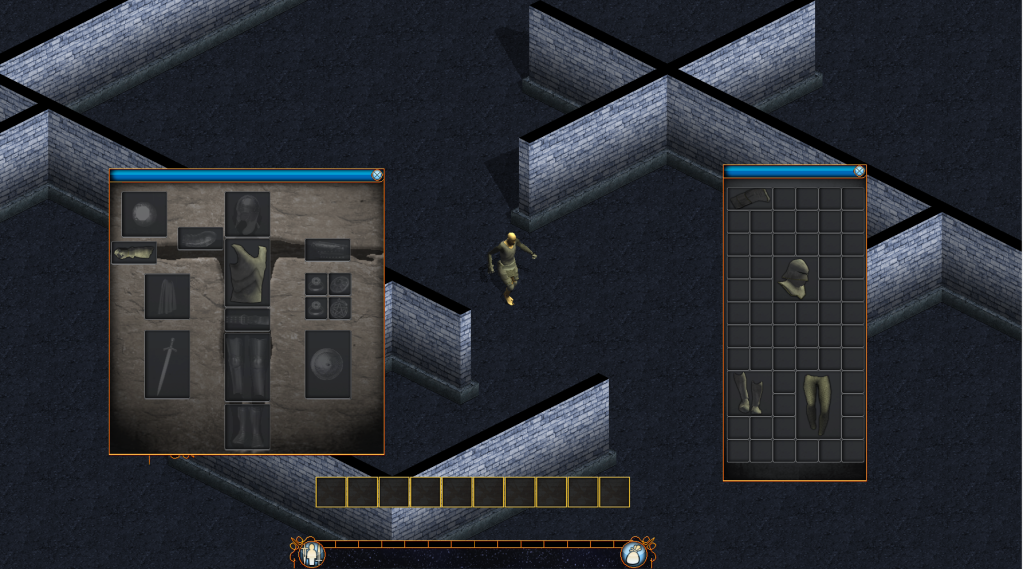
Photobucket

Low-quality video of inventory system:

A short video demonstrating Prism's inventory and equipment system. The frame rate is a bit choppy due to to the recording software. Also, the recording software re-sized the cursor. In the game, the mouse cursor, while dragging an item, is the same size as the item that is being dragged. The video also briefly demonstrates the HUD anchor system. Players will have the ability to arrange their HUD anyway they'd like, and the game will relocate the HUD objects if the screen size changes.
Nice Job, Mate! This looks very smexy. Shadows make me giggily.
Good work. It's nice to see the game progressing so well.
I'd ask you to make the inventory system and such a bit more updated, make something new. It looks all the same, in line with all the other MMO's and such I've seen. Do something new, it does look good, but I want this to look fucking fantastic.
Game seems to be looking good. I like the inventory, but if you can figure out something new like UPD4T3 said do it.
Sure. What ideas do you guys have for a different inventory system?
By the way, when we talk about different inventory systems, my perspective is based on, "How does the system improve on player game-play?" Different is good, but only if an improvement is made. For instance, in many popular MMOs, inventory items are all the same size, which can make finding specific/important items a difficult task. This is why the current inventory system in Prism uses items of various sizes. This way, we can create items of negligible or inferior importance a smaller size than items that are important/need to be found often. So, with that said, I'm certainly open to ideas! I just don't want to implement something that is different for the sake of being different =). Let the ideas flow!
Well I like the inventory as it is now. Reminds me of some diablo and everyone loves some diablo.

But if you could figure out a new way that was going to improve on us players game-play then go on ahead an do it.


EDIT: Also whats up with the weird stance the character is in when he stops walking?
Rockeyx2 wrote:
Well I like the inventory as it is now. Reminds me of some diablo and everyone loves some diablo.

But if you could figure out a new way that was going to improve on us players game-play then go on ahead an do it.


EDIT: Also whats up with the weird stance the character is in when he stops walking?

The only current animation in the game is the running animation. So for now, the standard "pose" is just a freeze frame of the running animation. Nestor is going to be working on a standard and combat pose in the near future.
NefariousDevelopment wrote:
By the way, when we talk about different inventory systems, my perspective is based on, "How does the system improve on player game-play?" Different is good, but only if an improvement is made. For instance, in many popular MMOs, inventory items are all the same size, which can make finding specific/important items a difficult task. This is why the current inventory system in Prism uses items of various sizes. This way, we can create items of negligible or inferior importance a smaller size than items that are important/need to be found often. So, with that said, I'm certainly open to ideas! I just don't want to implement something that is different for the sake of being different =). Let the ideas flow!

I'd do more hotslots, like the latest Zelda: Skyward Sword. I don't wanna be jumbling through my inventory a lot.
Pretty sexy. Your walking animation does look a little awkward but there's plenty of time to resolve that.
How did you get your game screen to stretch perfectly without black borders and the HUD to auto place.

http://img341.imageshack.us/img341/3264/guyvv.jpg
Sonder wrote:
How did you get your game screen to stretch perfectly without black borders and the HUD to auto place.

http://img341.imageshack.us/img341/3264/guyvv.jpg

The HUD auto-places by reading the size of a label element. Based on the size of the label-element and the size of a tile in Prism, each HUD element has an anchor percentage and a pixel offset. If I remember correctly, I needed to add some code to account for letter-boxing. It functions almost exactly like BYOND's support for window element anchors.

To get the map to stretch perfectly, set the icon-size in the map element and don't check "stretch to fit." I think you may also need to set world.view to higher than what you actually intend to display on your map.

[edit]Nice work on the bomber-man-looking character.