It looks good to me but i know it can look better :3 any suggestions. >.< don't bitch tho...
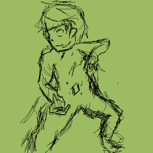
Okay So i been working on this title screen. not sure how its going but i like it so far. I'm not good with all this poses and stuff so i don't know if its correct or not.
It looks good to me but i know it can look better :3 any suggestions. >.< don't bitch tho... | |
Nov 2 2012, 5:25 pm
|
|
BayJune
|
The right leg(bended one) looks a bit werid. His leg is a bit too fat.
|
Ahh I see ty ty :3 i'll post some updates on this changing yes the head a bit too. It looks to big right now :3.
| |
I can afford Pencil...But i can't afford Paper. :( donate? :)?
| |
Uh
- His ear is attached to his jaw more or less. - His head is quite large, unless this is chibi. - His left leg looks muscular, while his right leg looks slim. - He has no neck. - His wrist looks broken, on the right arm. - His femur on both legs is shorter than his tibia = big no no That should be enough. | |
Sorry if i didn't make his jaw more Uhh Seenable? xD but yeah i agree his heads a bit large that's why i said i was changing it...Left leg as in the right leg in the picture of left leg in the picture. He has a neck i took it off adding the scarf he's going to wear. Again with the picture thingy but yeah i think you mean the funny crooked one. Changing that up too xD Lols. Femur? xD sorry i don't want to feel dumb but i don't know.....and tibia.(isn't Tibia a Game on here o_O??? Or was it called something else.)
| |
Ooops Forgot the Updated Pic x_x
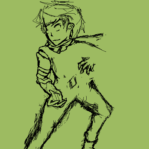 Still workin on the scarf x_x still doesn't look right. Also changing the position up a bit not sure if it'll look correct tho lols. AND Yes still working on his left hand Lol F-in me up right now x_x trying to get it to look good lol. | |
The femur and tibia are bones
http://arabbones.com/educations/ Rotational-Deformities-in-Children_files/image004.gif Femur's are by default larger, you made it the other way round. | |
Oh Lols i see thanks ;3. It looks good now tho..i think haha not sure..
| |
His left shoulder is extremely pointy.
| |
Which one? His right or left shoulder...but his right shoulder is kinda pointy like that because of the armor, i tend to like making armor like that for some reason..Lol
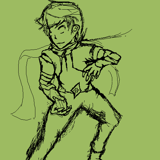 But another update by the ways. I feel at the moment his arm looks to small so im going to still have to fix that. But other than that right now it looks like he has to small of a body xD so imma try making him bigger later. The Scarf is not done yet and i'm still working on that lols | |
GAhhhh :{
I guess this is it x_x this was too annoying to make. I can't even color Lols. I'm hoping to make a better one but next time.No background btw >.> cause i don't know how or what background to put/add. 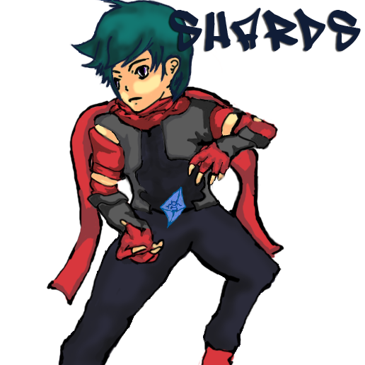 | |
Uh, you ruined it, either do it in pixel art, or don't color it lol...
| |
I was doing it in pixel art but then i got mad cause my mouse kept screwing it up when it jerks (i have a semi broken mouse it scribbles a lot) so i decided to just color it. I might go back and finish it in Pixel Art though.
| |
Looks icky.
| |
xD sadly right now i agree with that :3
| |
Cool :)
  I honestly cannot do Anatomy right at all.. something always goes out of proportion or most of it. so Nice job! though i'm not keen on how you colored that :( | |
its beautiful. O_O
| |
Falcon lazorz wrote:
VixiV wrote: I was too ;3 | |
http://imgur.com/BIRZv
Seems I can't embed the image? A - Shin is too flat, and that leg is too skinny compared to the other. Since you can't see the other foot, it even seems too short in comparison B - Crotch seems offset, as though his pelvis is crooked. Shift it <- a bit. C - Scarf flow doesn't feel very natural, I doubt it would be floating up there unless something forced it to stay there. D - Ear doesn't have much detail, looks a bit more like a belly button E - Jawline is too soft, seems like it should be defined a little more F - Forearm is really skinny, and seems flat. Use some shading to make it seem more round, and perhaps even give it some more thickness. The other forearm has this problem a bit, but barely. Eye - That eye is far too low in comparison, and with how the face is shaped doesn't seem to fit there. The way the iris and pupil are drawn it makes it seem as though he has a lazy eye. I suggest reshaping the face there, and re positioning the eye, and even the iris and pupil. * - Some of the contours are excessively thick, just makes it seem rushed to me. Other than that, I like the pose idea and the colors are appealing. This style seems to be sorta chibi-inspired. With some work it could turn out pretty awesome. For a background, it could be anything that matches the theme of your game. Just draw it up and make sure he's positioned in right, then you're set. | |