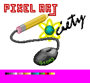
Post your completed entries for the logo contest here.
Deadline is 9/14. Judges should refrain from C&C in this thread. All others are welcome to. This thread will be heavily moderated.
If you want C&C without posting your work as an entry, use the WIP thread.
Good lucks!
ID:194957
Aug 31 2007, 2:12 pm
|
|
Aug 31 2007, 5:44 pm (Edited by moderator on Sep 19 2007, 9:04 am)
|
|
Honestly, did you READ more than one line of the rules?
"The background must be transparent. Canvas: 180x140 pixels. (You're also one pixel over on this one, 179 x 140) Colors: 32 max (not including transparency)." It doesn't seem like you understand what 32 colors means. http://i5.photobucket.com/albums/y168/Zenigwolf/ BLAJLKZBJ.png Notice that? I put a limit of 255 colors to show on the palette, notice how many spots are being taken up? Also, don't try to copy, resize, than paste something as your work. You can tell the palette and brushes aren't pixel art cause of the anti-alias. And the lack of anti-alias on the letters. Then there's the part about TRANSPARENCY</emphasis>. If you want to at least have a chance at winning, do some thinking and effort beforehand. | |
heres some i made there no limit to the amount u can post right?
      all of these have the handy psd files if u need them easy to edit colour etc.. thanks for taking the time to look at em | |
Entry for the contest. I kept it very simple, but still try to make it look good.
http://i214.photobucket.com/albums/cc302/SystemOPN/ PixelArtcontest2.png I used 11 colors, or i think 11 but it's all done in pixel art no use of the letter feature in graphics gale. any ways if it is regulation just leave it, but if its not the right size does not have a transparent background let me know. | |
The background must be transparent.
I'm thinking Monkey might change this... It's easy enough for us to make the background transparent if you make it a solid color anyways. Meh, at least it's the first "finished" work that's actually pixel art. | |
I was kinda debating whether i should make the canvas into a monitor and have his hand on a mouse on a desk to the side, but I decided against it =)
| |
If this is for the contest, it should have been posted in the wip thread or contest thread. No harm anywho, I'm sure monkey can just move it into the correction section.
It's interesting but you went way over the color and size limits. "Canvas: 180x140 pixels. Colors: 32 max (not including transparency)" | |
Two things:
1) I've changed the transparency requirement. If you're unable to figure out PNG transparency or can't save as a transparent GIF, you can leave the background as a single, solid color (that won't count towards the 32) and we'll remove the background later. 2) Pay attention to the following requirements. Any that don't follow these guidelines will be shot and/or disqualified (in that order). They ain't that hard, society-peoples! To say 'em again: "The background must be transparent (or, if you're unable to do a transparency, make it a single solid color so we can make it transparent if it wins). Canvas: 180x140 pixels. Colors: 32 max (not including transparency). Content: Must include art elements mentioned above. Actual painter optional. ;)" | |
 I didn't feel like putting in "Society". Notify me if it's required. <.Hoowell, Rob wins. | |


