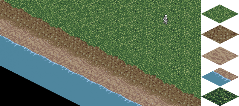
The top grass definitely looks better, but yeah, that bottom one is still pretty interesting. Add some stagnant water and mud under the leaves, and you have yourself a nice marsh.
Honestly, though, I can't help but feel the grass is a little bit busy. | |
Everything looks so smooth, nice work. Are you using another program for iconing or is this done on dream maker?
| |
Mitz001 wrote:
Everything looks so smooth, nice work. Are you using another program for iconing or is this done on dream maker? I am using GIMP along side with dream maker. Gimp, for me, makes it easier to start off a piece and experiment because I can zoom in an out without a that little bit of lag DM has when you zoom with it. DM I find is useful for changing colors really quickly. | |
BayJune wrote:
Nice, I like the top grass better, fits the mood. But the water is a bit plain. There are several reasons for why I choose to make it plain or simple. One, it's easier to animate. Two, I was thinking the grass tile was bit too busy and this would be balance that. | |
Edit: The bottom grass looks marshy.