This

This

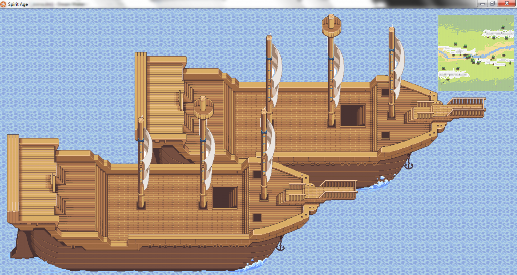
Also! Apparently this is a thing? Chuckle, it's one of the current works in progress.

ID:1059027
Nov 21 2012, 4:17 pm
|
|
Nov 21 2012, 4:32 pm
|
|
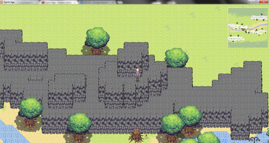
It could just be me but the dark grey rocks/cliffs look a bit out of place in the middle of a bright forest.
| |
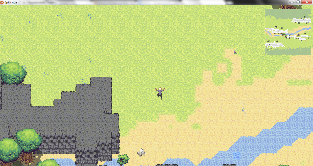
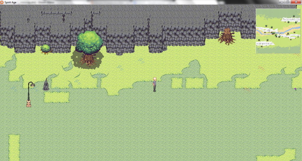
I would highly recommend revising those cliff and water tiles, as they have very apparent grid patterns. The grass tiles could also be improved a bit.
You should read this nice tutorial on how to do exactly that. Make sure you read it all, and the bottom portion especially. | |
Multi basically just said Zane is terrible and in need of way more practice. And I wouldnt have said that if it wasnt for the last line:
Make sure you read it all, and the bottom portion especially. | |
Hate, please keep your hateful comments to yourself. There is no need to start conflicts. I am genuinely trying to offer some help on something that I see in need of improvement. When I do pixel art, I'm always very thankful if anyone offers to critique my work or point out any flaws. Feedback is always a great way to improve any kind of artwork. It doesn't matter how experienced the artist is. I added that you should read all of it, because the tutorial doesn't get right to the point, and people might just decide that it's a waste of their time. Zane is one of the more excellent pixel artists on BYOND. I was not implying that he isn't. I would never go so low as to put someone down based on their artwork, and I definitely wouldn't go as low as to falsely suggest that someone else was doing that.
| |
Isnt hateful just thought you sounded a little rude how you said it.But I fully understand were your coming from now after reading that response.
Back on topic. I would have to agree with the gray cliffs looking weird were they are placed. Change them to a brown color? | |
Well folks, the mapping was done by Chris for testing purposes, As you can see he used the wrong tile set here. I mean look, he as a light post in the middle of no where, so please dont expect these things to be present in the final revisions.
further removing the grid in the water tile is fairly easy. | |
Zane444 wrote:
Well folks, the mapping was done by Chris for testing purposes, As you can see he used the wrong tile set here. I mean look, he as a light post in the middle of no where, so please dont expect these things to be present in the final revisions. Did not notice the light post. | |
Akriloth wrote:
Zane444 wrote: Neither, hahahah. That is gold! | |
So Chris and Zane are doing this together again.
*Announcer taps on microphone* "Can this duo complete this task before losing all hope in this game?" "Does Multi truly hates Zane's artwork?" "Will I finally get that ice cream cone, I so much desire?" "Stay tuned for next week's episode: Trouble's from with in" | |