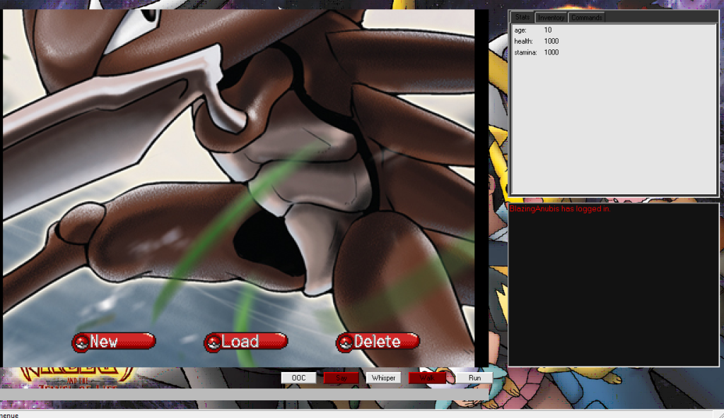
Screenshots from the game I'm making. So far, I'm the only one working on it. If ya wanna help, feel free to message me =D
Main menu: http://i164.photobucket.com/albums/u30/Wolflink234/ screenshot1.png
Character Creation 1: http://i164.photobucket.com/albums/u30/Wolflink234/ screenshot2.png
Character Creation 2:
http://i164.photobucket.com/albums/u30/Wolflink234/ screenshot3.png
Pokeball on Ground:
http://i164.photobucket.com/albums/u30/Wolflink234/ screenshot4.png
Catching a Pokemon:
http://i164.photobucket.com/albums/u30/Wolflink234/ screenshot5.png
Professor Oaks Lab:
http://i164.photobucket.com/albums/u30/Wolflink234/ screenshot6.png
After I get the basics done, I will have it so you can choose your starting region =O.
The login screen looks terrible.
The character creation looks terrible, mostly because of the stretching and how close all of the hair choices are. The screenshots in general look terrible because you cut out a portion of the window. I recommend puush as a good screenshot program. | |
Looks good except the interface skin. EW. Never use pictures as a background like that, just change it to pokedex red or something.
| |
Updated character creator: http://i164.photobucket.com/albums/u30/Wolflink234/ newscreenshot1.png
Starter Pokemon: http://i164.photobucket.com/albums/u30/Wolflink234/ newscreenshot2.png New Interface: http://i164.photobucket.com/albums/u30/Wolflink234/ newestscreen.png The pokeball shows your team, the pokedex will open the pokedex and scan wild pokemon, the notepad saves your game manually, although there is an auto save, the chat bubble logs you out, and the bag will open a new window, revealing your inventory. Caught a pokemon:http://i164.photobucket.com/albums/u30/Wolflink234/ newestscreen2.png When you catch a pokemon, the ball lights up. | |
Needs a different shade of red for the interface. It's the exact same as the buttons, which is ugly.
Character creation is just as ugly as before. A chat bubble isn't something I associate with logging out. You're going to cause a lot of confusion there. | |
It looks better than most BYOND Pokemon games, but the interface needs a lot of improvement.
| |
Not all the icons are. I made the overall pokeballs, the login and character creator icons, and edited the crap out of the hgss trainer to make the base.
| |
It is coming along, looks nice. You arent going to get much praise here for modifying Gameboy sprites but whatever, keep at it.
| |
BlazingAnubis wrote:
Screenshots from the game I'm making. So far, I'm the only one working on it. If ya wanna help, feel free to message me =D Wasn't gonna click on all those links; you're welcome. | |
BlazingAnubis wrote:
Updated character creator: | |
Now then, personaly I think the interface is aweful. The icons are alright, but nothing overly impressive. The character creations looks to be segregated to the lower right part of the screen and is in itself- ugly.
The colors on your interface clash WAY too much. The character creation is far too clunky and the colors you chose for the background are hidious when compaired to the other colors on the HUD setup. | |
Ok. Well This is what I have so far. I have to finish some of it, like the buttons and stats pannel. I tried to make it look as if it were a Pokedex.
 Direct link: http://i164.photobucket.com/albums/u30/Wolflink234/ Pokedexinterface.png | |
I don't recall any pokedex looking that way. Wern't all of them a lighter red?
But I may be wrong, I haven't watched anything past the first few seasons. | |


EDIT:nice delete your comment and make me look stupid >.<