ID:2380173
Jun 29 2018, 3:46 pm
|
|
 | |
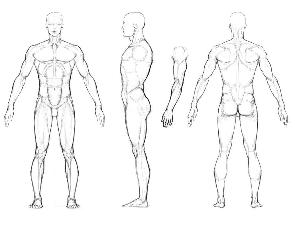
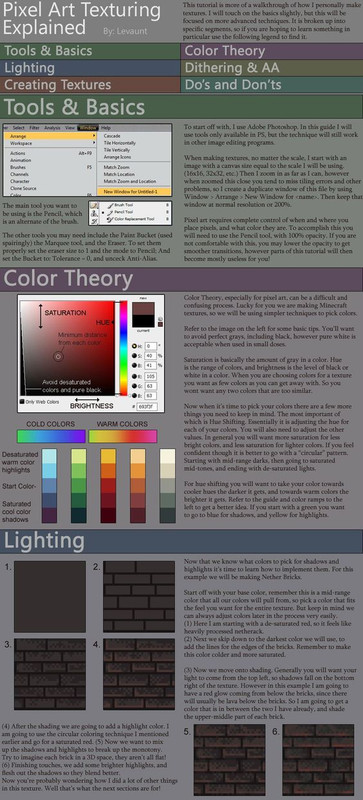
I use an outline so I know where to draw each line to. Proto-coloring makes a lot of sense, so you can see the details, however I'm able to see them no-matter the colors. I like adjusting them in real time until I get the right match.
It's kind of a step I skip because the real challange I'm having is proportions and positioning. Regardless I scrapped the initial image simply because my boundaries were too small so I'm attempting to try again with more effort and more work space. Another reason I using a border is because I want to have it shade out to give it a more 3 dimensional illusion. I'm focused on every single pixel blending with the next one. My current only shows the focus on horizontal shading.  Once I get the arms completed and map the basics features of the head my next step is to run through each line so that it gradually gets lighter toward the top. Then I have to work the verticle lines and map the physical features. Hopefully that makes sense. I'm very logical and want it to appear like the top have is popping out more than the bottom. | |
Interesting. My main goal is to show depth while also making a decent looking character model.
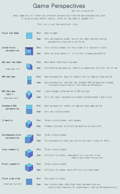
To do this, I figure we need to look at it from a realistic top down view in the sense that the feet would appear darker while the head would appear lighter. On that note, the legs would also probably appear shorter and smaller and gradually get larger. To be honest I just want to impose a realistic illusion of a 3 dimensional character in a 2 dimensional world. Ideally I could create 360 directions to show this, but that's a bit over doing it and would be VERY time consuming. | |
I like your mob, it'll make a good reference.
 I've added some definition to it. The edges are very noticable which I find a little irritating. The size I'm working with is meant to fit in a world I've created that has a base sizes of 70x70. The idea is to create a larger world which can be scaled as necessary. I think I need to orient the shoulders a little more forward as well. I think with clothes it might look a little more appealing, not sure if the face is too light or not yet. | |
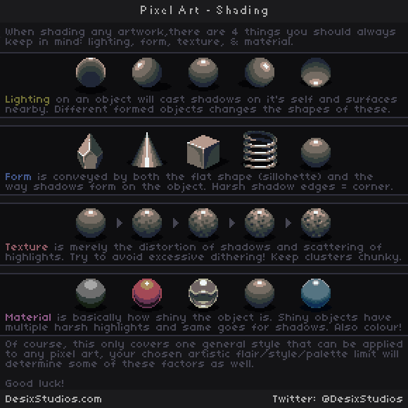
These are some extremely awesome resources, I appreciate the research! I'm going to study these and see how I can implement their research into my base mob.
| |
Before:
 After:  I'm not going to focus much more time on the body details because clothing will overlay it. I think this is pretty much it. Now I just have to work on the animations. | |
LemonYourAid wrote:
All 8 directions. I'll probably create more directions as transitional frames. I think buddy could use more of a neck. | |


Detail and shade:
Detail and shade:
Swap to production colors:
Add your outline last, if at all.
You wanna focus on that basic shape right off the bat by drawing the silhouette. You draw the outline first, you are gonna wind up being constrained by that outline, rather than making the shape readable. The point of an outline is to make low-color pixel art readable against background objects, as such, the shape itself without a background shouldn't even need an outline to be readable.
Again, this is the second stage pass where I was just working on form first. Started at the frontmost feature and worked my way backward on this guy:
(Finished variants of the above three here)
Final example: Spritework instead of portrait work:
Sketch of basic shape, using different colors to denote different parts and overlap.
Began to attempt to shade out the structure on top of the silhouette, just to get a feel for what he would look like.
Working my way across the detail with some early outlining in place.
Then I finished it up and did some small touchups.
On a black background with a player character for size:
Just focusing on the form, not the outline will make you a better artist in zero time flat. The rest of it is practice and being honest with yourself about where you are at.