Jul 11 2017, 8:52 am (Edited on Jul 11 2017, 8:58 am)
In response to Dubious Game Studios
|
|
Gold94
|
Dubious Game Studios wrote:
|

YURIRAMOS wrote:
Would not that cooler tonality be more graceful? Is it the artistic choice burn my eyes? Good thing it's his game and not yours then. I like the warmer tone. | |
Good thing it's his game and not yours then. I like the warmer tone. I like the cooler tone. Gives a more rustic, homey vibe. But that's just me. I really strongly dislike high-saturation in pixel art. Always have. | |
Ter13 wrote:
Good thing it's his game and not yours then. I like the warmer tone. Rustic, homey? This is obviously a Narto gam. Lots of high saturation artwork in shonen anime. | |
Ter13 wrote:
Good thing it's his game and not yours then. I like the warmer tone. I'm also for the cooler tone, however, his warm tone doesn't bother me either. | |
Mines warmer I prefer warmth
| |
My color choices aren't perfect I'll admit that but yours looks too gloomy for me
| |
I much prefer the cooler one. Saturated pixels are awesome but not when they're background tiles.
| |
Unwanted4Murder wrote:
Ter13 wrote: I can agree that high saturation is probably more fitting for narto. | |
:)
| |
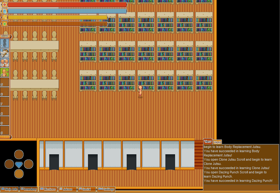
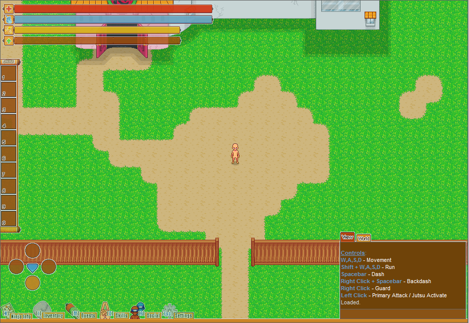
 New Interface elements and stuff and yeah idk why I gif'd just prefer them to images | |
 | |
Dubious Game Studios wrote:
That looks good, nice job! Hotbar position looks way better than before, in my opinion. Thanks :) | |
 | |
 | |
Thanks, in retribution:
 Another day I'll try to make the fall effect (With wind effect at this bioma). something like that:  | |
 Unwanted knocked the dust off his boots and got around to polishing up gibs some more! chunks now blow from a conformed center, guts get tossed around, and all enemies now have chunky, gib-elicious gibs! | |