So what i did was completley scrap my world (kept some ideas similair) and completley did an overhaul of the design. I also made the world 50% bigger. Next I think im going to move onto AI and shop keepers. Get that all set up and than finish the solo content by completing the dungeon systems.
So without further ado here is a few teaser images.
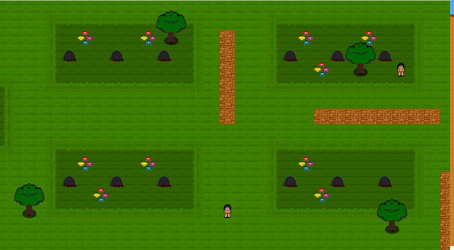
This replaced the gravyard.

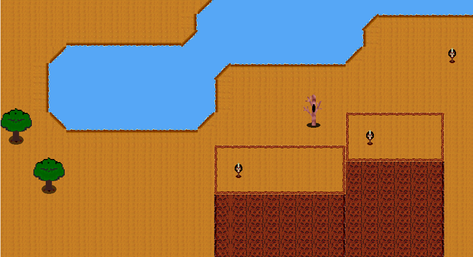
this area replaced my ugly mountain.

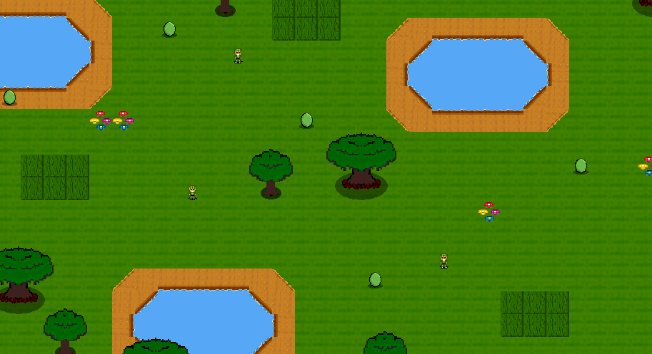
This area is right above a giant castle area, where these creatures have broken through the walls of it.

Tell me what you think?


The layout itself is hideous. Nothing has reason or rhyme to it. It's almost as if you pressed the arrow keys while randomly clicking on the map editor to place the bushes, flowers, trees.
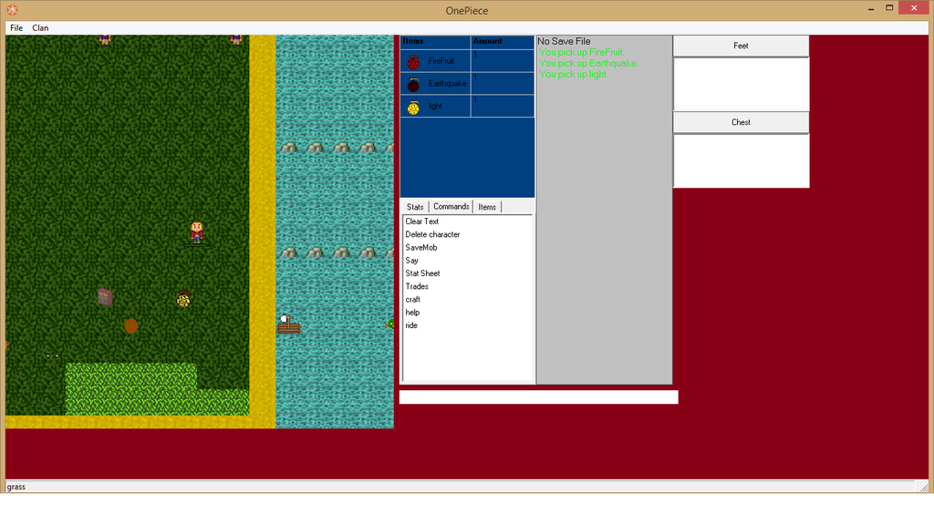
Here's examples you could benefit from:
Notice there's floral life placed strategically so there's not really a blank space. Even if you're using wide open planes, there shouldn't be filled full of only grass. Try to differentiate your grass by adding little patches of taller grass or flowers or weeds.
Notice the beautiful water and position of the edges with various aquatic herbal life.
Pulled from various DeviantArt sources