ID:194735
 
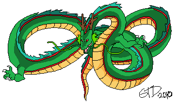
At FIRST I was like

Photobucket
[blehhhhhh lazy lazy lazy]

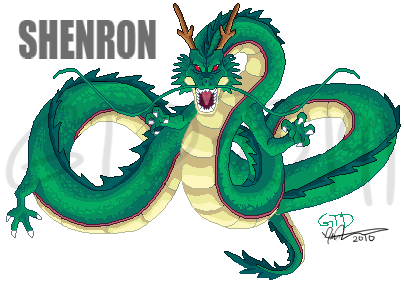
And THEN I'm like
Photobucket
[HAZZzZAaaaHHHHH!!]

Yeah, I just redrew it with a slightly different pose and pallet. You can tell I actually put work and effort on this one.
I hoped i fixed the problems from the first one. Also i'm not going to remove the lame watermark... worked too hard on it
Please tell me what you think.
Im not an artist,so i can't tell if there are mistakes in shading or anything,but to me:
This is Awesome!Great Job Man.
kinda.. messy, ill elaborate later.
In response to Chris-g1


I like most of it. Here are some improvements I can think of:

- He's missing a hind-leg.
- I've never seen him without all of his hands clenched in some way, your back leg is open and relaxed, which makes it uninteresting.
- The two-color shading on that spiky fin-thing that runs the length of his spine seems off. I'd add a third, significantly darker shade for depth. See also:
- See above, for the horns. I'd use a darker tone in there as well to give them a harsher look.
- There's too much symmetry. For instance, consider those two long whisker-like things that stick off of his face. They're doing the exact same thing; they should be flowing almost randomly, independently of each other. Asymmetry is good.
- The line-art for the spiky thing around his tail looks a bit awkward.

Other than that, I think you did a good job.
In response to Tor Crowley
Tor Crowley wrote:


oh wow thanks for pointing that i totally didnt see that
In response to Kuraudo
Kuraudo wrote:
I like most of it. Here are some improvements I can think of:

- He's missing a hind-leg.
- I've never seen him without all of his hands clenched in some way, your back leg is open and relaxed, which makes it uninteresting.
- The two-color shading on that spiky fin-thing that runs the length of his spine seems off. I'd add a third, significantly darker shade for depth. See also:

- See above, for the horns. I'd use a darker tone in there as well to give them a harsher look.
- There's too much symmetry. For instance, consider those two long whisker-like things that stick off of his face. They're doing the exact same thing; they should be flowing almost randomly, independently of each other. Asymmetry is good.
- The line-art for the spiky thing around his tail looks a bit awkward.

Other than that, I think you did a good job.

Thanks
-I actually thought i could get away with out drawing that other leg, I guess not lol I'll add them in
-For the spikes would adding a lighter color give the same effect or just stick with adding more darker color? I never really noticed how board like the spines were... I treated them like flowy hair spikes. Also why does the line art around the tail look weired to you?
-Lastly, I have to disagree with the hands and the Asymmetry, the reference i was using had the hands open so I left them that way. Also,...I dunno, I like symmetry a lot...only the head is basically fully symmetrical which I felt isn't so bad.
In response to GTD73191
Your newer one is SOOO much better. Nice color choice. :)
In response to Reeex
thanks : )
nice man, you improved heaps
It looks good. It's a huge improvement from the last dragon.
In response to Sticksisbest
Huge improvement for sure, but this piece needs anty-aliasing. Very much.