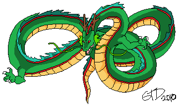
I also think I drew him a bit too small...

ID:194744
Oct 1 2010, 12:22 am
|
|
Oct 1 2010, 4:32 am
|
|
Still a lot better than anything I can make :/ I hate pixel art.
| |
yeah I'm well aware of where the light source was but then I was following my reference picture:
http://www.blu-ray.com/movies/ screenshot.php?movieid=1023&position=1 maybe its because I made the stomach color too dark in comparison to the light green | |
I'm not sure if it was intended but he looks way too nice looking. In the picture he looks kind of vicious, with a meanish face here he's smiling and looks even more like the Dragon Quest monster that ripped off of Shenron (for those curious, Divinegon. It's a green chinese dragon that looks EXACTLY like Shenron). Though if this was the intended art style (as I'm not sure) it's fine. It's the only quirk I can find in it, the rest looks very nice.
| |
Pmitch wrote:
No, dont use pillow shading at all.YES !! fack! PILLOWSHADING RULEZ!!(lie...)it was just an idea.(it would look better to me pillow shading the tongue) | |
oh lol i actually see that and it was not intended
I felt like i didnt have enough room to make it more vicious or probably i could of added more detail to change it but thanks | |
Its not bad but it won't make you art stand out. You should spend more time on it. Make it your own.
| |
It generally has no purpose except for very few cases. Think of it as a bad practice in general, like some features of the DM programming language.
| |
GTD73191 wrote:
is pillow shading really that bad? Its not bad,Pillow shading its like the light source comes just in front of your face,Wich is half impossible. you could better put a darker color in the tongue and not pillow shade it. | |
Pmitch wrote:
No, pillow shading is bad, and should not be practiced. Why?o.o.Give me a really good reason and i wont do it anymore <->. | |