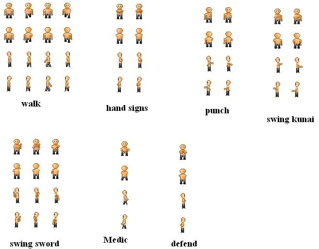
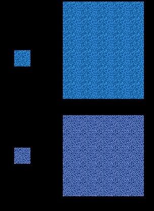
Here is my water I'm working on. I would like to hear other people's opinions on it and how I should go about filling it in.
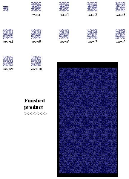
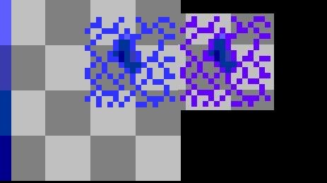
Maybe I need a fresh start?
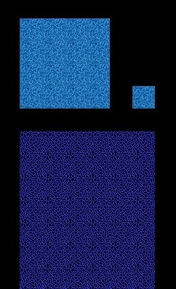
Is this any better?
Feb 21 2010, 12:43 pm (Edited on Feb 21 2010, 12:56 pm)
|
|
Any comments? I think my last one came out the best. Is it too small for quality detail?
| |
Its been over 2 days and Ive only had one comment thats not much compared to what I am seeing aroundme /=
| |
The water looks awesome. I especially like the top version in the bottom two sample images you've posted.
The sprite base is harder to comment on tactfully because of glaring anatomy issues. The arms are totally disconnected from the shoulders in many poses and overall it looks stiff and blocky. In my opinion, your best bet is to look up some anatomy primers around the tutorials section and start over from scratch. | |