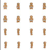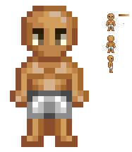
Front View

Rear View

East view

West View

Moving state (Sides not done yet).

Forward Movement

Rear Movement
Edit:
The movement goes a bit slower then that.
ID:258197
Jul 31 2008, 8:34 pm
|
|
Well, yeah. I have been working on a better base icon for my game. I posted my old one before (It doesn't show any images anymore), but my new one is a lot better in my opinion.
 Front View  Rear View  East view  West View  Moving state (Sides not done yet).  Forward Movement  Rear Movement Edit: The movement goes a bit slower then that. | |
Howey wrote:
Well, yeah. I have been working on a better base icon for my game. I posted my old one before (It doesn't show any images anymore), but my new one is a lot better in my opinion. Try nor ro pillow shade. And like Akto said, fix the legs in the north/south walking state. | |
Shape: Just looking at the legs you can tell it is in desprate need of a reshape =P
On side there were some body parts bigger then the south or north state, =P bad lol http://www.byond.com/members/PixelArt/forum?id=5342 Shade: How are you going about this, what direction are you adding and whatnot... http://www.itchy-animation.co.uk/light.htm Animation: needs to be a smooth animation, always look for reference before drawing =P http://www.byond.com/members/PixelArt/forum?id=4778  A general edit that you can build up opon... =P Also guys who have been doing C&C, why not SHOW him what you mean rather then just commenting o_O | |
Chris-g1 wrote:
Shape: Just looking at the legs you can tell it is in desprate need of a reshape =P Thanks, that is great help. I do think this base is far better than the old one I posted. XD I will edit it, and then repost it all. | |
Front View~
Shoulders are blocky. The shorts seem like a belt and why are the legs bulging out so much? Are they knees?
Rear View~
Same as the front view.
Side Views~
I guess they're okay. I think you would want one light source. Just because the person walks in the opposite direction doesn't mean the light source changes. Unless you want it that way.
Animations~
Honestly, I don't think anyone walks like that...
Lifting the feet up or down and making the an arm come forward doesn't make it walking. More like skipping on one foot at a time. When most humans walk one hand comes forward and the other hand goes farther back. Its the same for the feet.