ID:258091
 
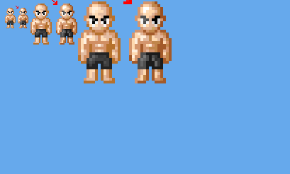
Well i was referred here by another person from byond to post my base thing i was doing for some fun.
I just started not too long ago maybe a couple months ago, but it wasn't my key so i made one. It's just a little test using some shading techniques i pick up form the fine people at pixel joint and my art teacher using inks.
Photobucket


Some constructive criticism would be nice.
Redbutton wrote:
Well i was referred here by another person from byond to post my base thing i was doing for some fun.
I just started not too long ago maybe a couple months ago, but it wasn't my key so i made one. It's just a little test using some shading techniques i pick up form the fine people at pixel joint and my art teacher using inks.

Photobucket


Some constructive criticism would be nice.
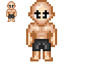
interesting, first id make the head shape less chibby lol

then change the pallet alittle because the current looks pretty flat, with the light source you implied you must keep it up threw out the whole time in production so it had its full potiental lol

Photobucket

k so here is the head so far... see the lightsource and pallet edit?

you must carry this on with the rest of the base lol now go and try it :)

here is what you should have so far...

Photobucket

shading might be alittle rough coz i did it quick lol
In response to Chris-g1
Actually i didn't implement the light source yet it was just a rough cut without it to see how the shades worked. As you can see i am a fan of the chibi look XD, but i can see what your going for. but for the one edit i see you modded the shoulders which I don't like just for the little aspect as it looks like he doesn't have shoulders it's just a little personal preference. I like the edit to the eyes. All in all i will take your advice for the head and take your fix for the eyes but the shoulders is not my style and the tones used for the third mod.

Edits: Photobucket
In response to Redbutton
Redbutton wrote:
Actually i didn't implement the light source yet it was just a rough cut without it to see how the shades worked. As you can see i am a fan of the chibi look XD, but i can see what your going for. but for the one edit i see you modded the shoulders which I don't like just for the little aspect as it looks like he doesn't have shoulders it's just a little personal preference. I like the edit to the eyes. All in all i will take your advice for the head and take your fix for the eyes but the shoulders is not my style and the tones used for the third mod.

Edits: Photobucket

I see youve got the fundamentals down, thats good to see, especially in the newcomers. Welcome to the guild, Im looking forward to seeing more work from you.

It looks like theres alittle pillow shading on the shorts, try giving it the same lightsource you gave the upper body. Personally i like to add a bit more definition to the chest lines.
In response to Legendary Goku 10
Legendary Goku 10 wrote:
Redbutton wrote:
Actually i didn't implement the light source yet it was just a rough cut without it to see how the shades worked. As you can see i am a fan of the chibi look XD, but i can see what your going for. but for the one edit i see you modded the shoulders which I don't like just for the little aspect as it looks like he doesn't have shoulders it's just a little personal preference. I like the edit to the eyes. All in all i will take your advice for the head and take your fix for the eyes but the shoulders is not my style and the tones used for the third mod.

Edits: Photobucket

I see youve got the fundamentals down, thats good to see, especially in the newcomers. Welcome to the guild, Im looking forward to seeing more work from you.

It looks like theres alittle pillow shading on the shorts, try giving it the same lightsource you gave the upper body. Personally i like to add a bit more definition to the chest lines.

thanks i will work on the pants,and see what i can do about the chest definition.

Here are some earlie edits. IT includes 200x200 side by side old and edit left is always the edit. Also a 400x400 side by side

Photobucket
In response to Redbutton
I don't think it's necessary to have lighter grays on the left eye. Makes things look more like that cheesy bevel/emboss photoshop setting. And I think you can get by just fine with just 3-4 different shades of gray instead of 6.
In response to AmonR
Redbutton wrote:
Actually i didn't implement the light source yet it was just a rough cut without it to see how the shades worked. As you can see i am a fan of the chibi look XD, but i can see what your going for. but for the one edit i see you modded the shoulders which I don't like just for the little aspect as it looks like he doesn't have shoulders it's just a little personal preference. I like the edit to the eyes. All in all i will take your advice for the head and take your fix for the eyes but the shoulders is not my style and the tones used for the third mod.

Edits: Photobucket

Seems when Chris edited the shoulders it seems he was going for fluidity (what alot of animes focus on). But you on the other hand Redbutton are going for Realism.

As for selective outlining, the transition is too quick from dark to light. I'm only specifically speaking of the "outline" for where the light enters. Also, this isn't some still piece like those at pixel joint/pixelation, it's going to be used for game. So keep in mind the usage of unnecessary additional colors and remember the light source doesn't have to be emphasized so strongly. You have the rest of the environment to show us this effect using shadows, etc. Post [link].

As for your shorts you have that highlight under his crutch which doesn't make any sense unless the character was tugging it toward us which would make me feel rather uncomfortable.
Image Hosted by ImageShack.us
Now the character has a knee so thats what will be closest to us so you want that "Near" in the middle. For more on those shorts, check out this post right here, Post [link].

Like LG said this work is really above norm for a newcomer or even for the average artist around here, this is why I always recommend help from sites like pixel joint.
In response to Hulio-G
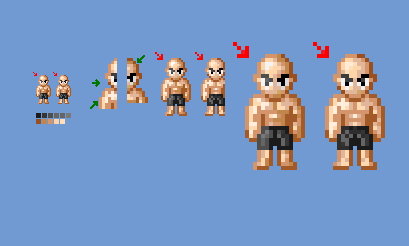
Well I did more edits to it lighten the really dark lines a bit and made the light to dark shades more of a better transition fixed the light source to the shorts and fixed the eyes. also cut down the pallet in the grey's by 2 or 3 shades.

Again it comes in 3 size so you can see the changes since I am blind as a bat. I do this so i can see them.the sizes are 200x200 and 400x400 and idk what the byond window size is but it looks like 32x32 or close to that.

Photobucket

Also i know i need to work on my shades and light sourcing, and a lot more so I'll work on that later.