http://www.byond.com/games/Berlin2222/NarutoNG
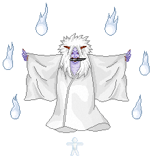
Im doing most of the pixel work and i just started making our latest jutsu could you tell me what you think? All critism aslong as its constructive is welcome :D.

ID:258517
Jun 20 2009, 5:13 pm
|
|
Hey jonaz here, im working on a new 100% original Naruto game with my friend Troj.
http://www.byond.com/games/Berlin2222/NarutoNG Im doing most of the pixel work and i just started making our latest jutsu could you tell me what you think? All critism aslong as its constructive is welcome :D.  | |
Jun 21 2009, 4:16 am
|
|
Shouldn't it be a bit transparent?
| |
I would show C&C but there is alooooot of unnecessary pixels in all the shaded areas, i would keep them smooth and darken the shade, then AA all the lines needing it.
| |
The shading is a little chaotic. I mean its creative but i don't think u really get the shape of the creature. like the by the arms the upper part of cloth should be lit up, because its close to the sunlight. because you didnt do this the arms don't look 3d. It looks as though hes just holding a white cloth, when hes actually wearing it. Also same with the torso.
Speaking of the sunlight, i dont know where its coming from in this pic. Also AA all needed lines. Itd make the whole thing look smoother and not as jagged. Love the colors you used and the blue fire is well done. Also a 3 or 4 state animation would make this great. If ur lazy just animate the cloth and the fire balls. but overall its really good and I really like its but its just a couple of minor adjustments from being great. | |
Fight For Supremacy wrote:
Nice Fight For Supremecy, instead of posting a lot of comments on the boards with only "nice""looks good" you might actually add some CC or something else. Now i'm no mod but you've already made 4/5 posts like those and it doesn't really contribute to anything. May i suggest that when you try to show your enthousiasme about a pixeled piece you state what you like etc. Sorry if i'm out of line here. | |
Pandora'sSecret wrote:
Fight For Supremacy wrote: Your spot on there PS, It is nice for people to appreciating others work and all but this is the 'Work in progress' section, not the showroom, what is needed more then anything is C&C :) | |
Little guy a bottom should be blue not white, and it should also be located in the middle of the death god not below him.
| |